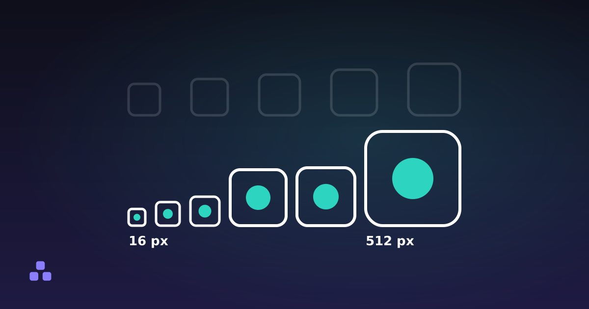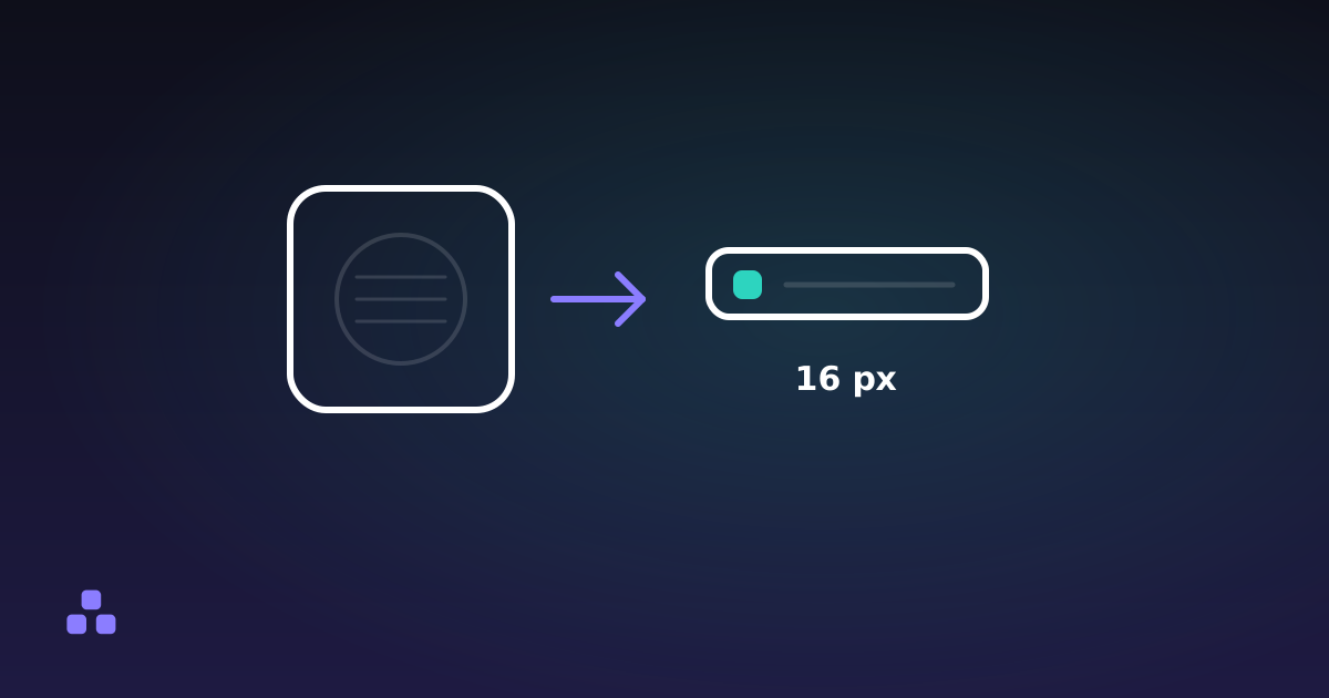
A favicon looks blurry in a tab because the slot is about 16 pixels wide, which is 256 pixels in total, and a logo designed on a large canvas has more detail than that can hold. Exporting it sharper does not help. What helps is drawing less: one letter or one symbol, strokes that are thick relative to the icon, and a look at the result at its real size before it ships. Which files and sizes to publish is covered in the favicon sizes guide; this page is about what goes inside them.
Why does a favicon look blurry in a tab?
Two things happen, and only one of them is the design's fault.
The first is arithmetic. A line one pixel wide at 16 pixels is a sixteenth of the icon. If it lands exactly on the pixel grid it is crisp; if it lands between two rows, as a line scaled down from a larger drawing usually does, it is spread across both at half strength and reads as a grey smear. Curves and diagonals have the same problem along their whole length.
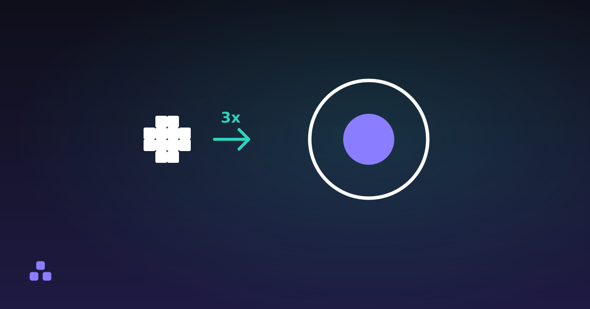
The second is scaling. The browser picks one image from the files you provide and resizes it to fit the slot. MDN describes the choice as based on the media, type and sizes of the candidates, so which entry you get is the browser's decision, not yours. On a high-density screen a 16-pixel slot is typically 32 device pixels, so a file that only contains a 16-pixel image is stretched and softened. A favicon.ico that also holds a 32-pixel image gives the browser a better starting point, which is why the favicon generator writes 16, 32 and 48 pixel images into one file. Odd display scaling, such as 125 or 150 percent in an operating system, can force a resample even when the sizes are right, so a little softness on some screens is not always something you can fix.
What survives at 16 pixels?
These are working rules of thumb from how pixels behave, not a standard:
- One shape or one character. Two or three simple shapes is the ceiling before the icon becomes texture.
- Strokes at least about a ninth of the width, so two pixels or more at 16. Anything thinner depends on landing exactly on the grid.
- A filled shape rather than an outline. A solid square or circle keeps its edges when everything inside an outline has dissolved.
- Two colours, with a strong difference between them. Gradients and soft shadows turn into banding.
- A little space at the edges. The generator's own hint says breathing room helps a dense logo at 16 pixels and too much makes it disappear, so it is a trade rather than a rule.
A quick test before any software: squint at the logo from arm's length, or shrink it on screen until it is a thumbnail. Whatever is still recognisable is the favicon. Whatever vanished was decoration, and it should not be in the icon.
Why does a wordmark fail where a single shape works?
A wordmark spends its width on letters. Four letters in 16 pixels leave about four pixels each, and the gaps inside an e or an a, the counters, are one pixel at most, so they fill in and the letters collapse into the same blob. A single shape gets the whole 16 pixels and can be solid.
The usual answer is to take the first letter, or the symbol from the logo, and use that alone. The generator's letter mode follows the same logic: it sets one character at 62 percent of the icon size, two at 50 percent and three at 40 percent, and its own hint calls three characters a smear at 16 pixels. If your brand name starts with a letter that looks like many others, a simple geometric symbol will serve better than a letter.
Contrast matters as much as shape, because you do not control the tab bar behind the icon. A dark glyph on a transparent background vanishes on a dark browser theme. A solid coloured background inside the icon protects against that. The contrast checker measures two colours against each other; WCAG's 3:1 for graphical objects is a reasonable yardstick for the shape against its fill, though that criterion was written for page content, not browser chrome. The contrast ratio guide explains where the figure comes from.
How do you test an icon at real size?
- Look at the 16-pixel file, not the large preview. The generator lists the 16 by 16 PNG with its image shown at actual size. Judge by that row, not by the 512 pixel version, which will always look fine.
- Check both browser themes. Open a private window in a light theme and a dark one. An icon that disappears in either needs a background.
- Put it in a real tab. Upload the files, open the page, and look at the tab beside other sites. Favicons are cached separately from the page, so use a private window to see what the server sends now; the favicon checklist walks through that.
- Try a second screen. A phone or a laptop with a different pixel density shows the scaled version your main monitor may hide.
- Ask someone to find it. Open five tabs and ask a colleague to point at yours. If they hesitate, the shape is not distinct enough.
What the generator can and cannot fix
The generator takes one source, an image or a letter, and scales it to every size. For an image it halves the picture repeatedly until it is near the target and does the last step from there, which keeps edges together better than a single resize, and it offers padding and a solid background. That is all it does to the artwork.
It does not simplify a logo for you, and it does not draw a separate 16-pixel version. If the icon matters, redrawing the small size by hand, with strokes aligned to the grid, will beat any automatic reduction; the tool cannot do that, and a hand-made .ico would need to be published as your own file. In letter mode the PNGs use a bold system font from your device, so the letterforms depend on what your computer has, and the optional SVG names a font rather than embedding one, which can render differently elsewhere. Nothing in the .ico adapts to a dark theme; only an SVG icon with a colour-scheme rule can do that, and the tool does not write one. The files are built in your browser, so the logo is not uploaded anywhere.
To see how your own mark holds up, drop it into the favicon generator and look at the 16-pixel row before anything else. If it reads there, the larger sizes will take care of themselves.
A vector source makes the simplifying easier, because you can resize and edit without losing anything; why a logo should be an SVG explains why.
Frequently asked questions
Why does my favicon look blurry in the browser tab?
The tab slot is about 16 pixels wide, so thin lines, small text and fine detail from a larger logo cannot be drawn cleanly. On high-density screens a file that only holds a 16-pixel image is also stretched. Simplify the artwork to one solid shape and include a 32-pixel image in the .ico.
What should a favicon contain: my full logo or just a part of it?
Just a part, usually one letter or one symbol. A full logo with a wordmark has more detail than 256 pixels can hold, so the letters merge into a blob. Pick the single element that people already recognise and let it fill the icon.
How thick should lines be in a favicon?
There is no standard, but as a working rule keep strokes at about two pixels or more on a 16-pixel icon. A one-pixel line only looks sharp if it lands exactly on the pixel grid, and a line scaled down from a larger drawing rarely does. Filled shapes avoid the problem.
Why does my favicon disappear on a dark browser theme?
A dark icon on a transparent background has almost no contrast against a dark tab bar, and a standard .ico does not change with the theme. Give the icon a solid background shape in a colour that stands out on both light and dark tab bars, then check it in each theme.
Last updated November 2, 2026