To put a gradient on text in CSS, paint the gradient as the element's background, clip that background to the shape of the letters, and make the letters themselves transparent so the background shows through. It takes three declarations:
.title {
  background-image: linear-gradient(90deg, #6d28d9, #db2777);
  background-clip: text;
  color: transparent;
}
That is the whole technique. The rest of this page is about the parts that go wrong, because transparent text is a risky thing to ship.
Why can't I set a gradient as the text colour?
The color property takes one colour, and a gradient is not a colour: it is an image. Images are only accepted by properties that expect one, such as background-image, border-image and list-style-image. So color: linear-gradient(...) is simply invalid and the browser throws the line away.
The CSS gradient generator writes exactly that kind of line, and only that. Its output is background-image: linear-gradient(...); (or the radial or conic equivalent), one layer, in sRGB. It does not write the clipping lines or a fallback, so for text you copy its line and add the other two yourself.
What do the three declarations each do?
background-image paints the gradient across the element's box. background-clip: text then restricts that painting to the area covered by the glyphs, so the gradient shows only inside the letters. color: transparent removes the solid fill of the letters, which would otherwise sit on top and hide it. MDN notes that the clip has little visible effect if the text is fully or partially opaque, which is why the third line is not optional.
Older versions of Safari and Chrome only understood the prefixed form, -webkit-background-clip: text, and a lot of stylesheets still carry both lines. Keeping the prefixed line costs nothing; whether you still need it depends on the oldest browser you support, and the compatibility table on MDN is the place to check.
One detail catches people on the first try. A heading is a block element, so its background spans the full width of its container, not the width of the words. A short title in a wide column shows only the first slice of your gradient. Make the element shrink to its text with display: inline-block or width: fit-content, and the gradient runs from the first letter to the last.
What happens if the clip fails?
The text disappears. color: transparent works on its own whether or not the clip is applied, so a browser that ignores background-clip: text still honours the transparent fill and shows a gradient box with no letters cut out, or nothing at all if the background fails to load. MDN's guidance is to provide a fallback and to use a feature query so the transparent colour only applies where the clip does:
.title {
  color: #6d28d9;
}

@supports (background-clip: text) or (-webkit-background-clip: text) {
  .title {
    background-image: linear-gradient(90deg, #6d28d9, #db2777);
    -webkit-background-clip: text;
    background-clip: text;
    color: transparent;
  }
}

@media print {
  .title {
    background: none;
    color: #000;
  }
}
The solid colour is the default, and the gradient is an upgrade for browsers that can do it. The print rule is there because browsers usually leave out background graphics when printing unless the person ticks a box, and a clipped background is a background. Open print preview on your own page before you decide you do not need it.
Does the contrast need to be checked at both ends?
Yes, and at the middle, and again on every page background the heading can appear on. Contrast is measured between the text and what sits behind it, and with gradient text the text colour changes along the line. The number that counts is the worst one anywhere on it, the same logic as the WCAG thresholds applied to every point instead of one.
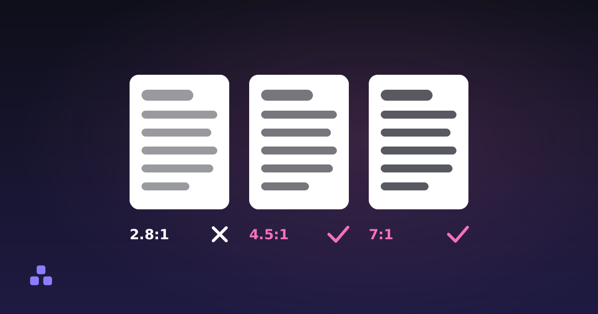
The example gradient above shows how it goes wrong. Against a white page, the violet end (#6d28d9) has a ratio of about 7.1:1 and the pink end (#db2777) about 4.6:1, so both pass the 4.5:1 threshold for body text. Put the same heading on a dark page (#111827) and the numbers become about 2.5:1 for the violet and 3.9:1 for the pink. The violet end now fails even the 3:1 that large text needs. Nothing about the gradient changed; the background did, which is the same trap described in choosing colours for dark mode.
Check each stop in the contrast checker against the page background. For the middle, remember that browsers blend sRGB gradients one channel at a time by default, so the midpoint of two stops is the average of their channel values. For the example, that is #a428a8, which is about 6.1:1 on white and 2.9:1 on the dark page. If two stops are far apart in lightness, the middle can be the weakest point, as the grey-middle problem shows.
What can't this approach, or these tools, do?
Three limits are worth knowing before you build on it.
- The contrast checker takes two opaque hex colours. It cannot sample a gradient, so you check the stops and the computed midpoint one by one, and a gradient with many stops or a radial shape means more checks.
- The generator writes one sRGB layer and no clipping or fallback lines, as described above. If you want the other interpolation space, you add it to the copied line by hand.
- Gradient text is decoration. A long paragraph set this way is harder to read than the same words in a solid colour, because the colour keeps shifting under your eye. It suits a headline of a few words at a large size.
I have not tested every combination of browser, operating-system contrast mode and assistive technology. Treat the fallback above as a floor, and test the page in the settings your readers are likely to use.
To get the gradient line, build it in the CSS gradient generator, copy the line, and add the clip and the fallback from this page. Then run each stop through the contrast checker before the heading ships.
If your gradient turns muddy halfway across, why a CSS gradient goes grey in the middle explains the arithmetic and the two ways round it.
Frequently asked questions
How do I make gradient text in CSS?
Give the element a gradient as its background-image, add background-clip: text so the background is cut to the shape of the letters, and set color: transparent so the letters do not cover it. Add the -webkit- prefixed clip line if you support older browsers. Wrap it in an @supports rule with a solid colour as the default so the text never ends up invisible.
Why is my gradient text invisible?
The text colour is transparent, so the letters only show if the clipped background paints behind them. If the browser ignores background-clip: text, or the background does not load, nothing fills the letters. Set a solid colour first and apply the transparent colour only inside an @supports rule for background-clip: text.
Why does my gradient only show part of its colours on a heading?
A heading is a block element, so its background stretches across the whole container, not just the words. A short title in a wide column covers only the first part of the gradient. Use display: inline-block or width: fit-content so the element is only as wide as its text.
Does gradient text pass accessibility contrast checks?
It can, but the text colour changes along the line, so the lowest contrast anywhere on it is the one that counts. Check each colour stop against the page background, and the midpoint too, which is the average of the stops when the browser blends in sRGB. Recheck if the same heading appears on a dark theme, because the background changes the result.
Can I use a CSS gradient as a text colour directly?
No. The color property accepts a single colour, and a gradient is an image, so color: linear-gradient(...) is invalid and ignored. Gradients are accepted by image properties such as background-image, which is why gradient text is done by clipping a background to the letters.
Last updated October 23, 2026