Do not invert your light palette. A dark theme works when the background is a dark grey rather than pure black, the text is an off-white rather than pure white, the accent colours are lighter and less saturated than their light-mode versions, and every text and background pair is measured again, because passing in one theme says nothing about the other.
Why does inverting a light palette go wrong?
Inversion flips lightness and leaves everything else alone, and several things in a palette do not survive that. A mid blue that was the darkest thing on a white page becomes the dimmest thing on a black one. A pale tint used for hover states and card backgrounds becomes a near-black that disappears into the page. A shadow, which was a dark smudge under a white card, has nothing to darken.
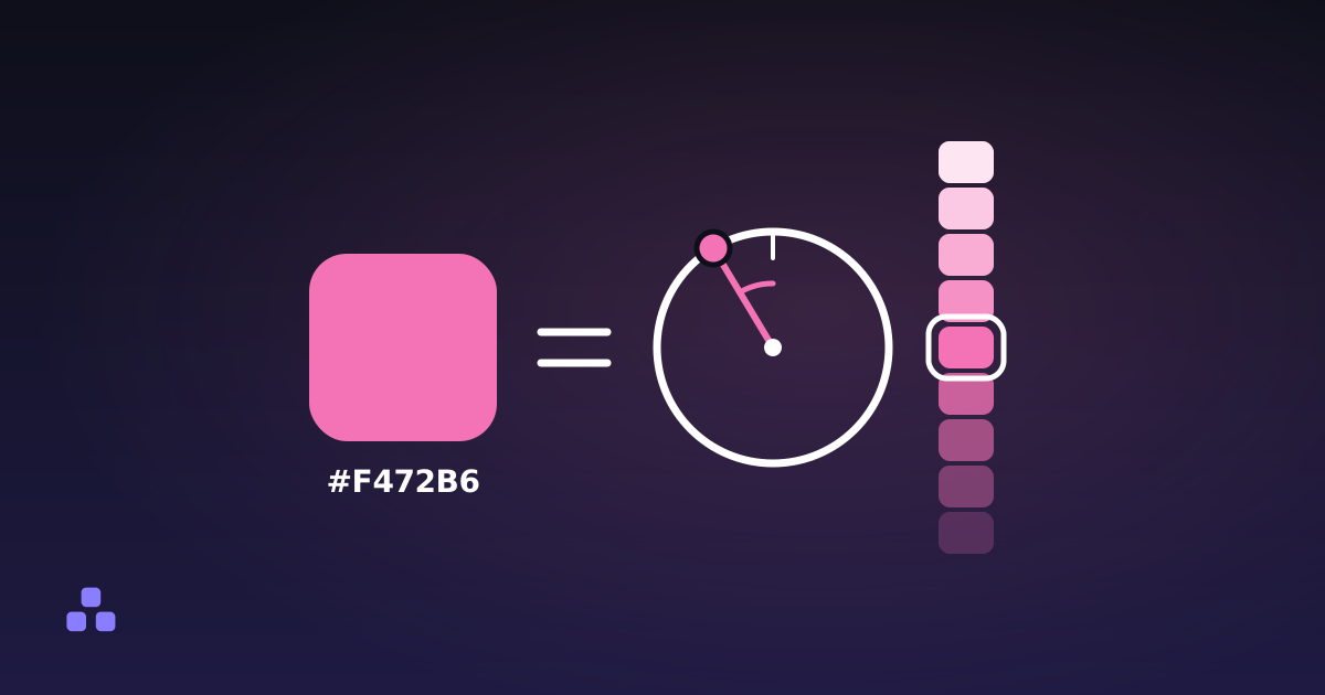
The better frame is that a dark theme is a second palette that shares hues with the first. You keep the hue of each colour so the brand is recognisable, and you choose lightness and saturation again for the new ground. If your light palette was built from a scale of steps from very light to very dark, the dark theme mostly picks different steps from the same scale.
Is pure white on pure black a problem?
It is the maximum contrast the formula allows, 21:1, and that is the reason it can be a poor choice. Large areas of white text on black give the brightest possible letters against the darkest possible field. Some readers, people with astigmatism among them, report that bright text on a very dark ground seems to glow and smear at the edges. How common that is, and how much it matters for a given person and room, is not settled, so treat it as a reason to test rather than a rule.
The usual remedy is cheap. A dark grey such as #121212 for the page and an off-white such as #E6E6E6 for body text still gives 15.0:1, which is far past the 7:1 level of the strictest WCAG tier. White on #121212 is 18.7:1. You give up very little contrast and take the harshness out of it. A pure black page does have one real argument in its favour: on some OLED screens black pixels are off. Whether that matters to you is a battery question, not a readability one.
Why do saturated colours look wrong on a dark background?
Because a colour that read as calm on white reads as loud on dark. A vivid blue or red against a near-black field vibrates, and the same hex value feels more intense when it sits in a dark surround. The fix designers reach for is to lighten the accent and pull some saturation out of it, so it sits back instead of leaping forward. You do this per colour by eye, and you check it afterwards, since lightening changes the number you are about to measure.
One side effect to expect: the dark-mode version of a brand colour is a different hex value, even though it is meant to be recognisably the same colour. That means two values to maintain for every colour you use, the same cost that comes with a second, wider colour space. A colour converter helps here because HSL lets you hold the hue and move only the lightness and saturation, then hand you the hex code to paste.
Do contrast ratios carry over from light mode?
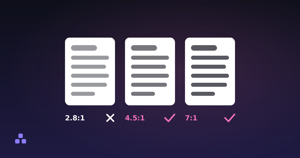
No. The WCAG formula is symmetric, so the thresholds are the same in both themes: 4.5:1 for body text, 3:1 for large text and interface components. What changes is which of your colours reach them. These are real calculations against #121212:
| Text colour | On white | On #121212 |
|---|---|---|
#1D4ED8 (blue) | 6.70:1, passes | 2.80:1, fails |
#93B4FF (lighter blue) | about 2.1:1, fails | 9.11:1, passes |
#DC2626 (red) | 4.83:1, passes | 3.88:1, fails for body text |
#6B7280 (grey) | 4.83:1, passes | 3.88:1, fails for body text |
The blue is the instructive row. It is a perfectly good link colour on a white page and unreadable on the dark one, and its lighter replacement has the opposite profile. Neither is wrong; they belong to different themes. Secondary text is the usual casualty, since a muted grey chosen to be quiet on white is often the first thing to fall under 4.5:1 once the page goes dark.
To test a pair, paste both hex values into a contrast checker. If the text colour fails, its nudge button moves the lightness of your colour, keeping hue and saturation, until it reaches 4.5:1, and tells you the new hex. On a dark background it goes lighter, which is the direction you want. The thresholds themselves, and what counts as large text, are in what contrast ratio you need for readable text.
How do you show depth when shadows do not work?
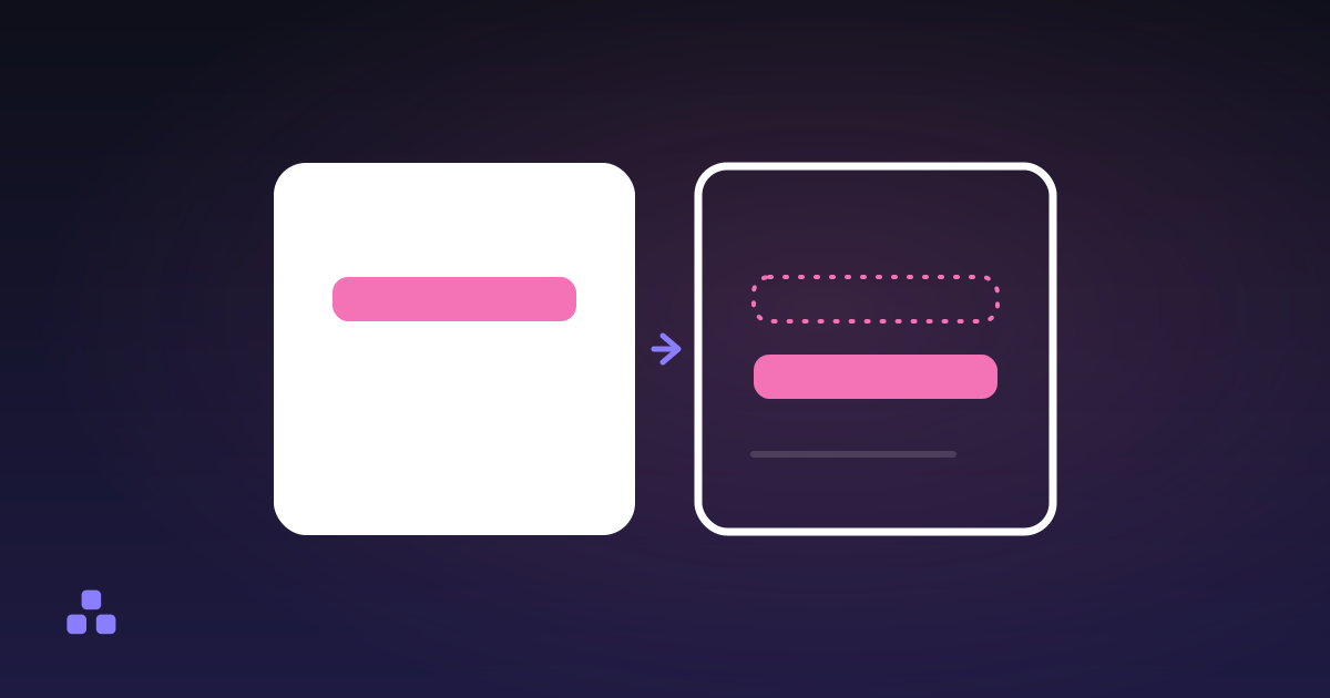
A dark shadow on a dark page is close to invisible, so the usual way to say that one surface sits above another goes missing. A common substitute is to make raised surfaces slightly lighter than the page: a card a step or two lighter than the background, a menu lighter than the card. It is a convention many design systems use, not a standard, and it has a limit. Stack too many levels and the lightest surface starts to look like a different theme. Two or three steps are usually enough, and each of them is another background your text has to pass against.
Every surface colour multiplies the pairs you have to check. Test your text colours against the darkest and the lightest surface they will ever sit on, and if they pass at both ends they pass in between.
What the tools here can and cannot do
The contrast checker takes six-digit or three-digit hex codes only. It does not read rgb(), hsl() or oklch() strings, it ignores transparency, so a semi-transparent text colour has to be flattened onto its background before you test it, and it implements WCAG 2, not APCA. It checks a pair you give it. It does not generate a dark theme, and it does not tell you that a colour feels harsh. The colour converter moves one sRGB colour between HEX, RGB and HSL and nothing else. Both run entirely in your browser, and nothing you enter is uploaded.
Which format to write your tokens in is a separate question, covered in which colour format to use. HSL lightness is not perceived brightness, so a lightness that works for one hue will not work for another. Measure each colour.
Once you have a dark palette, run every text and surface pair through the contrast checker, and use the colour converter to move a hex value into HSL and back while you adjust it. Both work on the colours you paste in and keep them in your browser.
If you are still deciding how many colours the palette needs, how to choose a colour palette that works covers neutrals and states, which a dark theme leans on more than a light one does.
Frequently asked questions
Should dark mode use pure black for the background?
Usually a very dark grey such as #121212 works better. Pure black with pure white text gives the maximum 21:1 contrast, which some readers find harsh over long stretches. The one argument for pure black is that some OLED screens switch black pixels off, which is a battery matter rather than a readability one.
Why do my colours look too bright in dark mode?
The same saturated colour looks more intense against a dark surround than against white. The common fix is to use a lighter, less saturated version of each accent in the dark theme, keeping the hue so the brand is still recognisable. Measure the result afterwards, because changing the lightness changes the contrast ratio.
Do WCAG contrast rules apply to dark mode?
Yes, with the same thresholds: 4.5:1 for body text and 3:1 for large text and interface components. The formula is symmetric, so swapping text and background gives the same ratio. A colour that passes on a white background can fail on a dark one, so each theme has to be checked on its own.
Can I just invert my light theme to get a dark one?
It gives a usable starting point and a poor result. Inversion flips lightness only, so mid-tone accents lose contrast, pale tints turn into near-black backgrounds that vanish, and shadows stop working. Treat the dark theme as a second palette with the same hues and newly chosen lightness and saturation.
Last updated October 5, 2026